Role: UX Research, UX Design, Prototyping, Front-end Development
Timeline: 3-week design sprint to re-imagine and conceptualize the FNOL experience
Tools: Figma, UXPressia, Smaply, HTML, CSS, JavaScript
Narrative: A caller waits on the line, but the FNOL system is a maze - slow, repetitive, and disorienting. With every extra step, the pressure builds, and so does the chance of a critical mistake.
This reflects the real frustrations some claims specialists face, navigating repetitive forms, unclear flows, and high-pressure calls. From a UX perspective, these are not just usability issues. They create stress and can increase the risk of errors during sensitive, time-critical moments.
This project was a focused concept study, an exploration of how the FNOL experience could be reimagined through modern UX principles. It represents a creative, forward-looking approach to guide future improvements, not a finalized solution
Role: UX Research, UX Design, Prototyping, Front-end Development
Timeline: 3-week design sprint to re-imagine and conceptualize the FNOL experience
Tools: Figma, UXPressia, Smaply, HTML, CSS, JavaScript
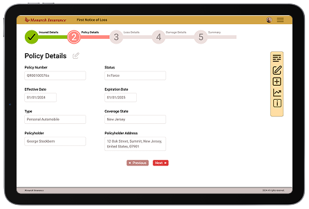
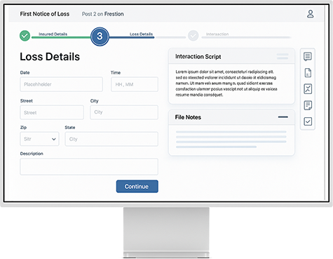
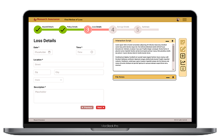
In the realm of insurance, First Notice of Loss (FNOL) is the initial report made by a policyholder to their insurance company, notifying them of an incident or event that may lead to a claim. This notification typically includes essential details about the incident, such as the date, time, location, and nature of the loss or damage, as well as information about any involved parties and witnesses. FNOL is the first step in the claims process, initiating the insurer's response and investigation into the reported event.
UX research, surveys, and direct user feedback revealed that the FNOL experience was clunky and disorienting. Users faced a complex entry process with little visual feedback or indication of progress, leading to stress, second-guessing, and inefficiency during a critical, high-pressure task.
They needed a smoother, more supportive interface, one that integrated better with surrounding systems, guided users visually, and adapted to how they actually worked.
The challenge was to reimagine the application as something transparent, intuitive, and reassuring—an experience that reduced friction and supported users through every step of the claims process.
Users expressed a clear need for improvements in various aspects of the system, with a primary focus on streamlining the entry process.
Manual and repetitive processes increase the risk of errors and consume significant time, leading to frustration and inefficiency.
Outdated, non-intuitive interfaces and poor integration with other systems (e.g., File note, Insights, policy databases) slow down the workflow and disrupt seamless operations.
Difficulty adapting to new rules to ensure compliance with ever-changing regulations.
Modern, intuitive interfaces that streamline navigation and reduce the learning curve for new users.
Automating routine tasks and integrating AI to assist with data entry and initial claim assessments.
Better integration with other systems to create a unified workflow and reduce the need for redundant data entry.
Allow users to customize workflows and dashboards to better suit their specific needs and preferences.
The goal was to streamline the FNOL process, improving both efficiency and user experience. A comprehensive UX design process was followed, including in-depth research, persona development, user journey mapping, design, and prototyping. Changes were introduced thoughtfully to align with existing user expectations while ensuring a practical, user-centered solution for the insurance software landscape.
Through qualitative interviews, quantitative analytics, and surveys the goal was to gain valuable insights from key stakeholders and users, ensuring a wide range of perspectives.
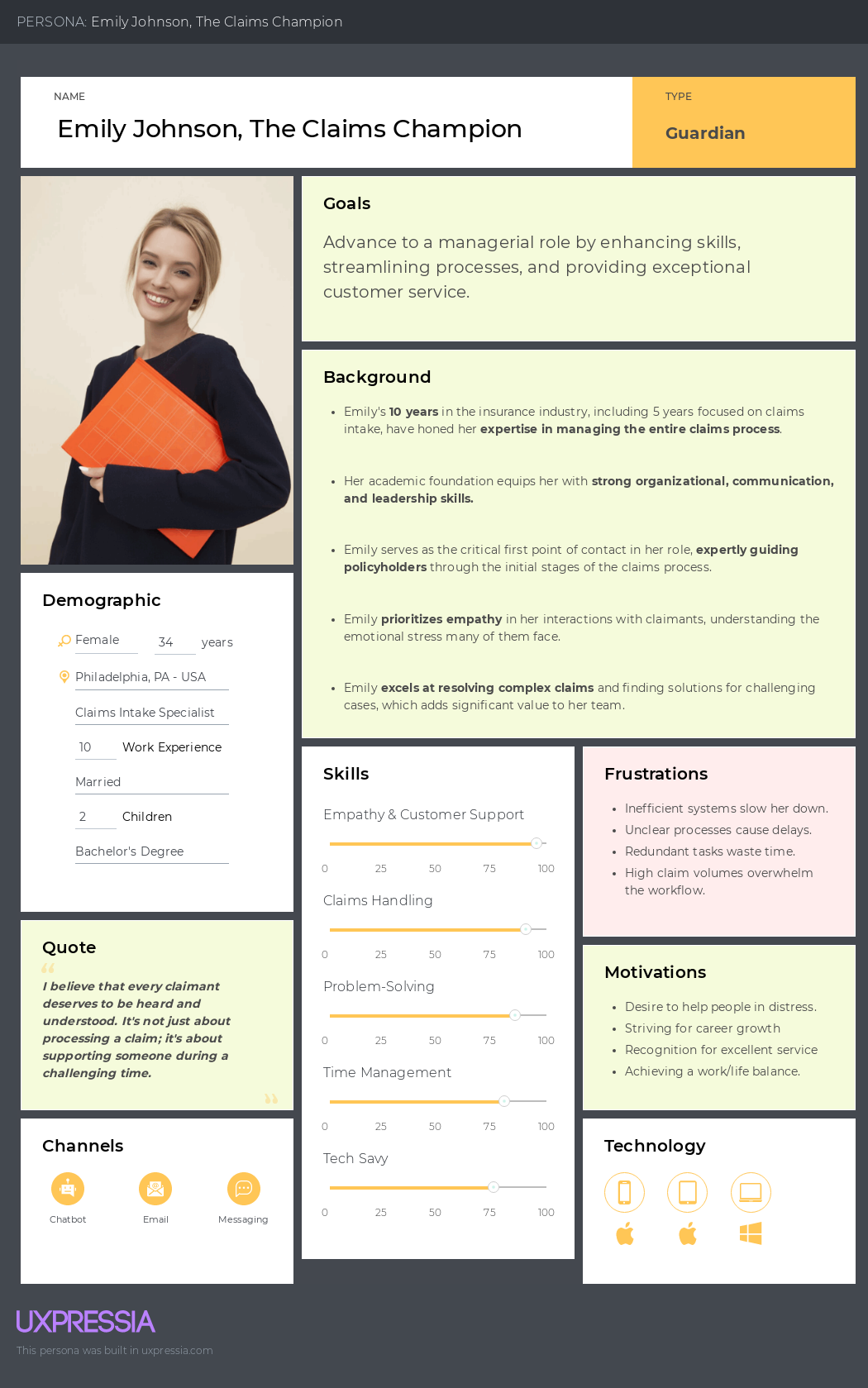
Using a combination of qualitative and quantitative research—including interviews, surveys, analytics, and user testing—key personas were developed to guide the design process. The initial focus is on a primary, aggregated persona for the MVP, with secondary personas planned for future iterations. These personas reflect the core traits and needs of a Claims Intake Specialist, ensuring a user-centered approach to the design.
Emily Johnson represents the core characteristics of a Claims Intake Specialist, with a strong focus on empathy, efficiency, and problem-solving. Her role revolves around streamlining the claims process while delivering compassionate support to policyholders.
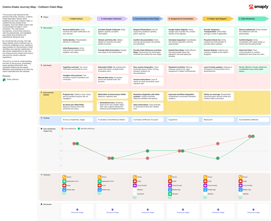
Using insights from qualitative and quantitative research—such as interviews, surveys, and user testing—the claims intake journey map was developed to visualize the step-by-step process that Claims Intake Specialists, like Emily Johnson, follow when managing auto collision claims. This basic journey map outlines each phase of the process, capturing both the pain points and emotional journey experienced.
By identifying inefficiencies and emotional challenges, the journey map helps drive UX improvements, ensuring a smoother, more efficient workflow that enhances both employee experience and claimant satisfaction.