Role: UX Research, Prototyping, Front-end Development
Timeline: 6-month collaborative effort across UX and Engineering teams
Tools: HTML, CSS, JavaScript
Narrative: You are deep into processing a complex claim when a key detail comes to mind. You go to record it, but the system forces you to leave your workflow, navigate to a separate screen, and juggle multiple tabs just to type a simple note. Focus fades. Details slip. And just like that, something important risks falling through the cracks.
That was the everyday reality for claims professionals. Through user feedback and collaborative discovery, the team recognized this was more than just a minor inconvenience, it was a persistent friction point that disrupted focus, slowed productivity, and increased the risk of losing critical information
Role: UX Research, Prototyping, Front-end Development
Timeline: 6-month collaborative effort across UX and Engineering teams
Tools: HTML, CSS, JavaScript
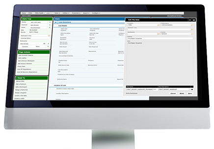
In the world of insurance, File Notes are detailed records maintained by claims professionals during the insurance claims process, documenting communications, actions taken, decisions made, and updates about the claim's progress. These notes typically include critical information such as policyholder interactions, conversations with involved parties or witnesses, investigative findings, claim evaluations, and rationale for settlement decisions. File Notes serve as an essential audit trail, ensuring transparency, consistency, and compliance throughout the claims handling process.
The team was tasked with redesigning one of the most heavily used features in the system, without disrupting the familiar workflows users relied on. While essential to their daily tasks, the existing File Note functionality forced users into inefficient workarounds: switching between screens, juggling multiple windows, or relying on third-party tools.
The experience was slow, fragmented, and often frustrating. Feedback made it clear: users needed a faster, more intuitive, and customizable solution, one that integrated seamlessly into their real-world workflows and reduced unnecessary friction.
Users needed to capture information quickly without breaking their concentration or leaving their current task. Forcing them to switch screens or open new tabs interrupted their thought process and increased the risk of losing important details.
The repetitive need to leave the main task flow just to add a note led to unnecessary clicks, slowed productivity, and increased mental fatigue—making routine actions feel burdensome over time.
The necessity to shift from their current work page to the File Notes page was disrupting the seamless flow of claims management for users.
Users encountered additional confusion when attempting to self-solve these challenges by resorting to the practice of opening new tabs or windows for each claim to input notes.
The primary goal was to enhance the accessibility of the File Notes system across the entire claim life cycle, ensuring practical use for real-world scenarios. This approach followed the key stages of the UX design process, starting with in-depth research, persona development, journey mapping, and progressing through design, prototyping, and usability testing. Given the familiarity of the feature to users, careful consideration was taken to introduce changes aligned with user expectations while maintaining ease of use.
A combination of qualitative interviews and surveys was used to gather valuable insights from key stakeholders and users, ensuring diverse perspectives were captured. The feedback and support requests provided a thorough understanding of user pain points and challenges, further enhanced by interviews with professionals experienced in insurance and claims handling. By organizing the findings into themes and trends, a holistic view of user needs and preferences was formed, guiding the project toward a more user-centered solution.
User personas were created based on research and interview insights to guide the design process. A primary persona was developed for the MVP, capturing key characteristics and needs, while secondary personas were identified to address other user segments in future iterations.
The journey map then provided a visual guide to the file note process, taking into account essential factors such as the line of business, user roles, and the current stage in a claim’s life cycle. This helped create a clearer understanding of how users interact with the system and shaped the design to better support their workflow.
The design process began with brainstorming sessions, where ideas were sketched out and user flows were mapped. Key user needs emerged, including ensuring File Notes were accessible without leaving their current task and accessible across workflows, removing the need to open multiple windows, and offering a dynamic, resizable interface.
The goal was to create an easy-to-use, familiar, and flexible interface that minimized friction for users. Lo-Fi wireframes were iteratively refined, and discussions with engineering ensured alignment on platform requirements, technology constraints, and feasibility.
Usability testing began after the initial designs and prototypes were ready. Internal users explored low-fidelity wireframes, providing valuable feedback that led to improvements and the development of a working HTML prototype. This prototype evolved through multiple iterations, with each round of testing addressing engineering concerns and refining the design. Continuous feedback helped resolve any issues, ensuring a more polished and user-friendly experience.
The redesigned File Notes system was successfully launched, seamlessly integrating across all pages and workflows. The new floating interface allowed users to continue their tasks while interacting with File Notes, offering flexibility with a moveable, resizable design that adapts to individual work styles. This innovative solution significantly boosted user performance, improving satisfaction and proving to be a major success with clients. The enhanced features were well-received and made a tangible impact on workflow efficiency.
( Some visuals in this case study are limited or lightly blurred due to NDA restrictions. These examples are used with care to reflect my front-end and UX contributions while maintaining client confidentiality. )