Role: UX Research, UX Design, Prototyping, Front-end Development
Timeline: First iteration completed in 4 weeks; continuing development in progress
Tools: Excalidraw, Figma, HTML, CSS, JavaScript
Narrative: What started as a few rough sketches quickly became a live prototype powering a major product demo, but getting there meant pivoting fast and designing smarter. With the clock ticking, I needed to shape a raw UI into a confident, intuitive experience that brought the product vision to life.
Role: UX Research, UX Design, Prototyping, Front-end Development
Timeline: First iteration completed in 4 weeks; continuing development in progress
Tools: Excalidraw, Figma, HTML, CSS, JavaScript
The company's AI-powered FNOL Management System is designed to modernize the claims intake process in Property and Casualty insurance. By integrating seamlessly with existing platforms, it uses document parsing, predictive analytics, and a virtual assistant to streamline first notice of loss, automate reserve forecasting, and support faster, more accurate decision-making across underwriting and claims. The result is a smarter, more efficient insurance experience—for carriers and customers alike.
The founder of a promising AI-powered FNOL (First Notice of Loss) application reached out for help refining the product's user experience. While the platform was functional, the interface was minimal and not yet ready for client-facing demos.
With an important sales presentation approaching in just a few weeks, he needed fast support to transform the experience into something polished, intuitive, and presentation-ready. This would serve as the MVP for the first iteration, focused on core workflows and key interactions, with future enhancements planned for upcoming phases.
While the core functionality was in place, the interface lacked the clarity, structure, and polish needed for product demos.
Early wireframing sessions revealed gaps between the founder's vision and how users might intuitively navigate the system.
A rapidly approaching sales presentation required an accelerated process, from conceptual wireframes to a live prototype in a matter of days.
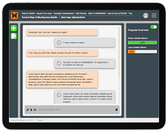
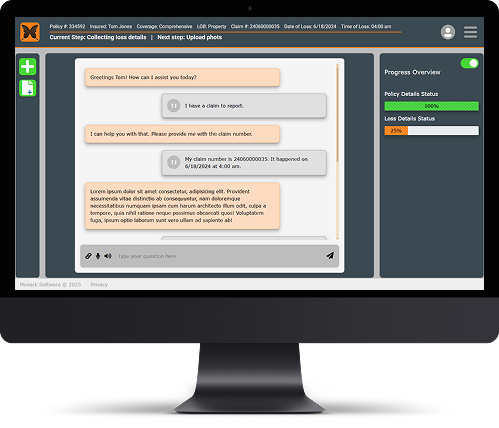
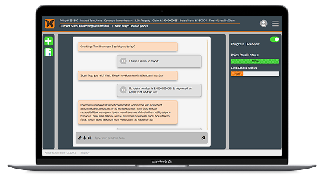
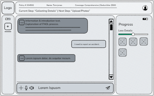
Design a layout that kept users oriented throughout the claims intake flow, using visual indicators and iconography.
Prioritize core workflows and build a live, mobile-responsive prototype that could be confidently demoed under pressure.
Translate a high-level product vision into an interface that felt modern, intuitive, and grounded in real-world user expectations.
Aligning Vision with Function
With previous experience in UX from an insurance background, I understood the FNOL workflow and its unique challenges. I started by sketching low-fidelity wireframes in Excalidraw to visualize key tasks and layout options. These early conversations, shared via Zoom, quickly surfaced misalignments, and allowed us to clarify priorities and functionality without getting caught up in visual details too early.
Pivoting to High-Speed Prototyping
Originally, I planned to move into high-fidelity designs using Figma. But with the presentation looming, I pivoted and went straight to building a live HTML/CSS/JavaScript prototype. I prioritized responsive, mobile-first design from the beginning, even though the immediate focus was desktop, to ensure long-term flexibility and scalability.
Designing with Familiarity and Clarity
To guide the design, I researched leading AI platforms like ChatGPT and Claude, along with productivity tools such as Slack, Jira, and Monday.com. These tools shaped expectations for visual feedback, clarity, and intuitive interfaces. I applied this insight by incorporating universal iconography, clear progress indicators, and a strong visual hierarchy that kept users oriented and confident throughout the FNOL workflow.
Used the company's signature orange as the foundation.
Critical actions placed prominently, secondary items pushed to the periphery.
Progress indicators and consistent iconography guide user flow.
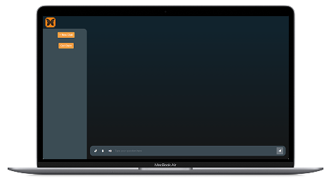
Ensured adaptability across devices.
The final prototype was delivered ahead of schedule, giving the backend team valuable time to integrate AI components. After minor refinements to color and layout, the founder was extremely satisfied with the result, and had a demo-ready product that clearly communicated product vision.